Project Intro
About Frankly
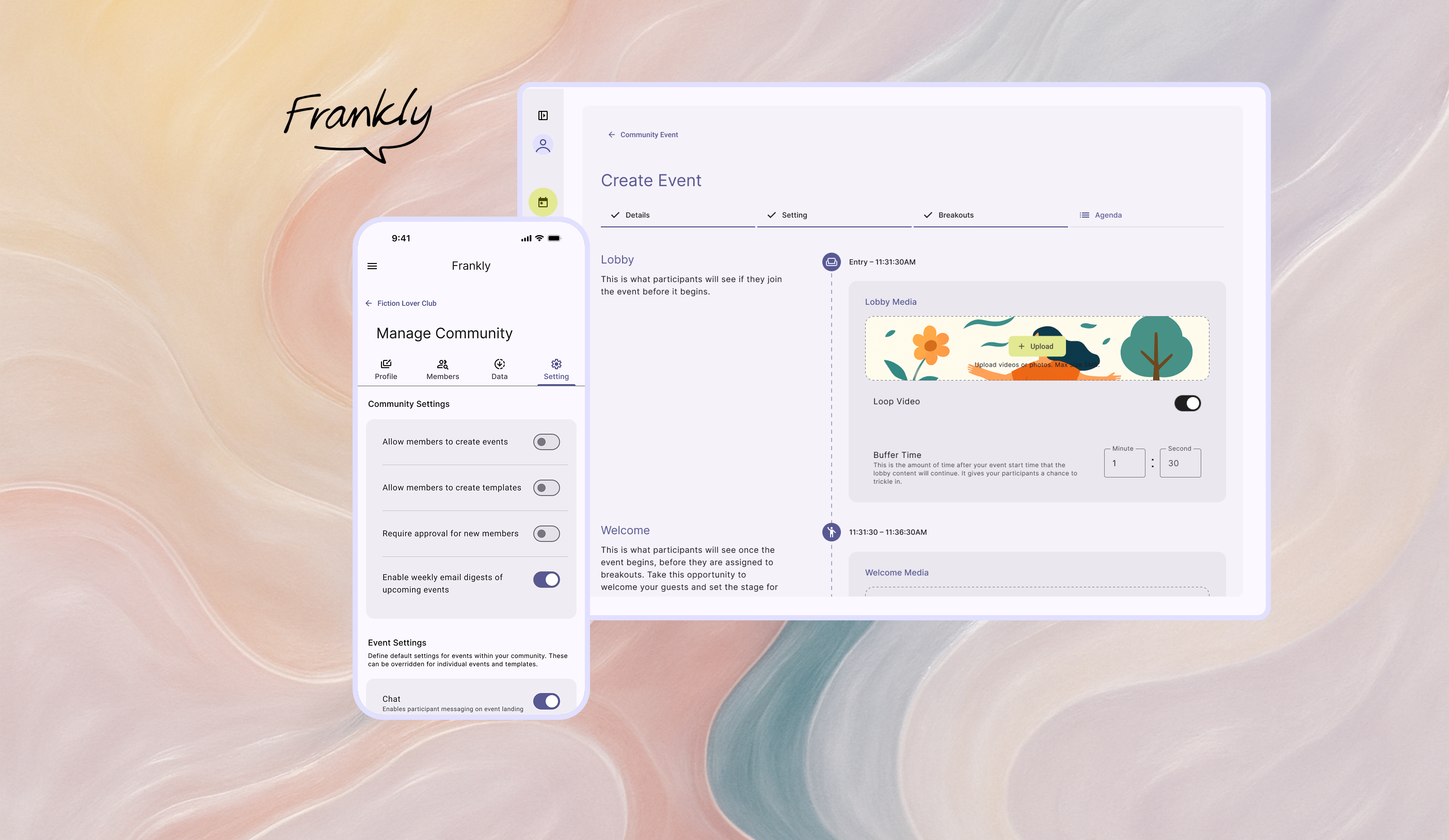
Frankly is a deliberative democracy platform that transforms how communities welcome different perspectives from members and make decisions together.
My Role
Senior UX Designer
design system build,
PRD writing,
Interaction,
visual design,
prototyping,
design documentation & handoff
Tools
Figma, Notion, Github
Adopted By
leading civic and dialogue organizations across the U.S. including:
- Deliberations.us
- AllSides
- Living Room Conversations
- Listen First Project
- Unify America
What makes Frankly different?
Unlike other Standard video conferencing tools optimizing for connection efficiency, Frankly™ is a video-based discourse platform designed to facilitate constructive dialogue and collaborative decision-making across and within diverse groups.
Offer hosted or hostless events for various meeting styles and participant preferences.
Facilitate discussions with structured agendas embedded directly within the platform.
Gather feedback and crowdsource solutions collaboratively.
Automatically create balanced breakout rooms to ensure a variety of perspectives.
Design Example
Hand-holding the event Creation Flow
THE TRIGGER
Engineering flagged a high volume of 'unfinished event drafts' cluttering the backend. Users were initiating the creation process but abandoning it halfway through.
I conducted a heuristic evaluation to understand why.
THE AUDIT
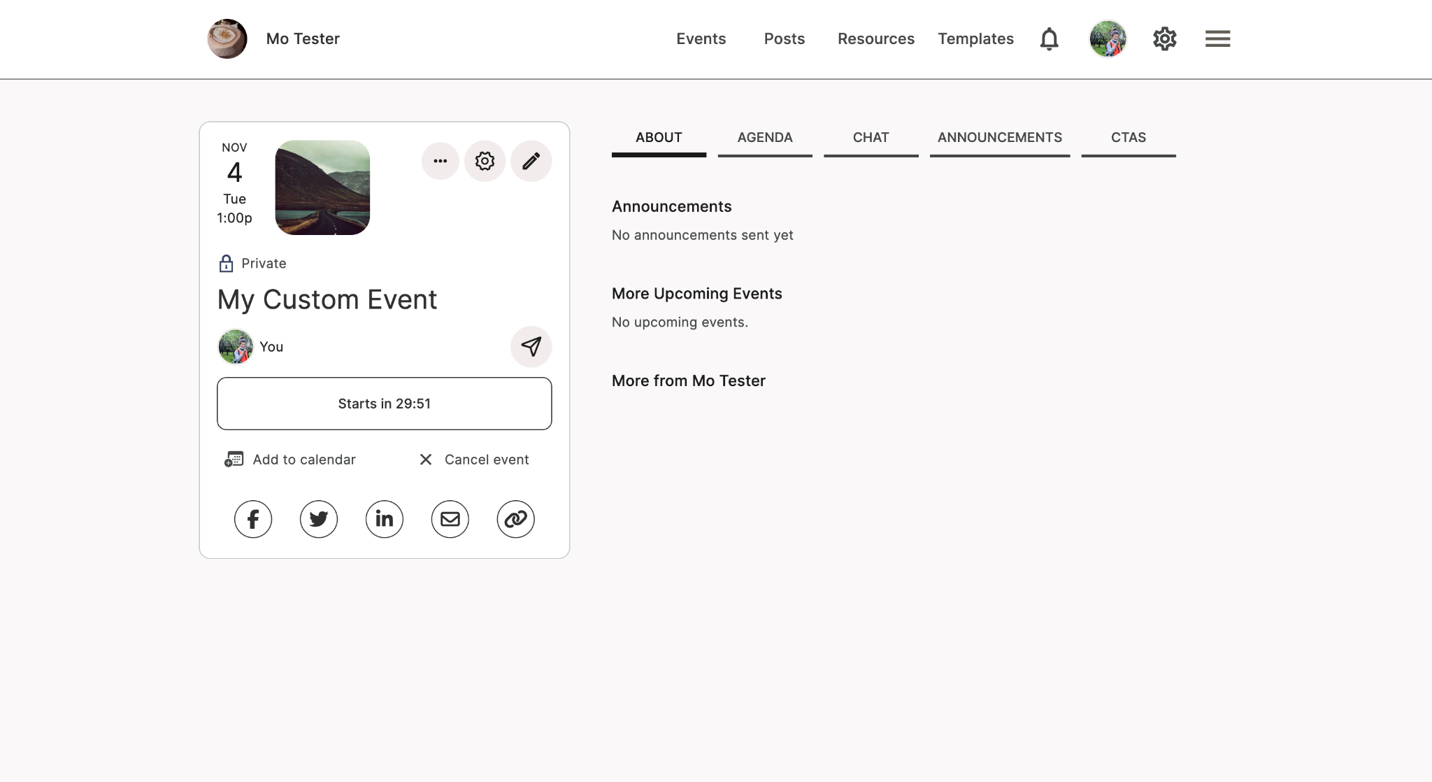
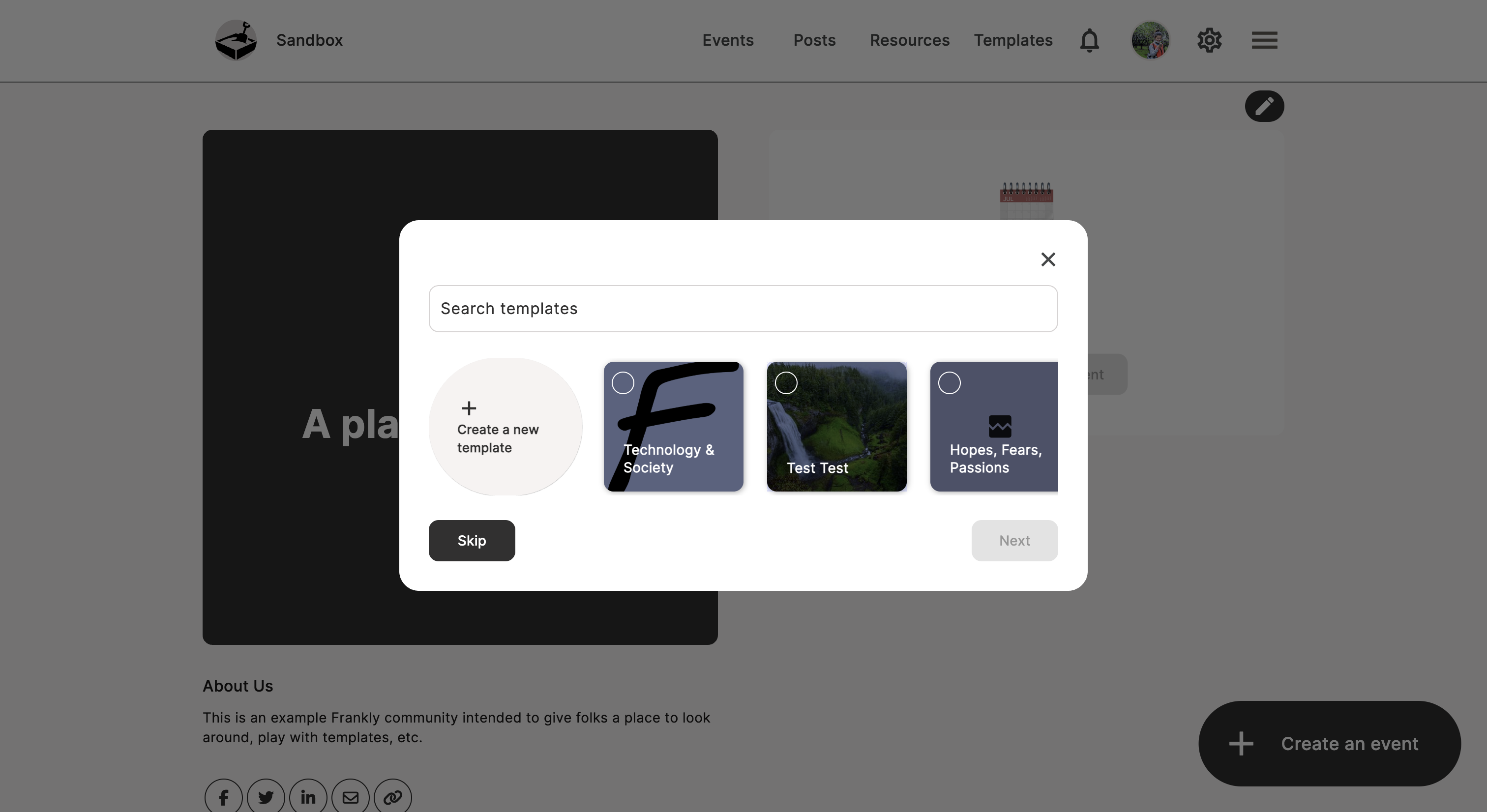
User Experience Assessment - I took screenshots of every step that users are going thru and seeing, evaluating from Visual Design, Functionality, Consistency, and Information Design perspectives.
Dead End: Zero state lacks call-to-action or onboarding guidance
Lack of System Status: Users are unsure if the event is already created/saved or being edited.
Competing iconography lacks text labels and hierarchy
THE DIAGNOSIS - THE USABILITY GAP
The interface suffered from a lack of system status visibility. Users didn't realize their drafts were auto-saving, and the absence of clear 'Next Steps' caused them to bounce out of confusion rather than intent.
THE OPPORTUNITY
How might we replace the ambiguity of the current flow with a hand-held structure, ensuring users have the clarity they need to successfully publish an event?
THE SOLUTION
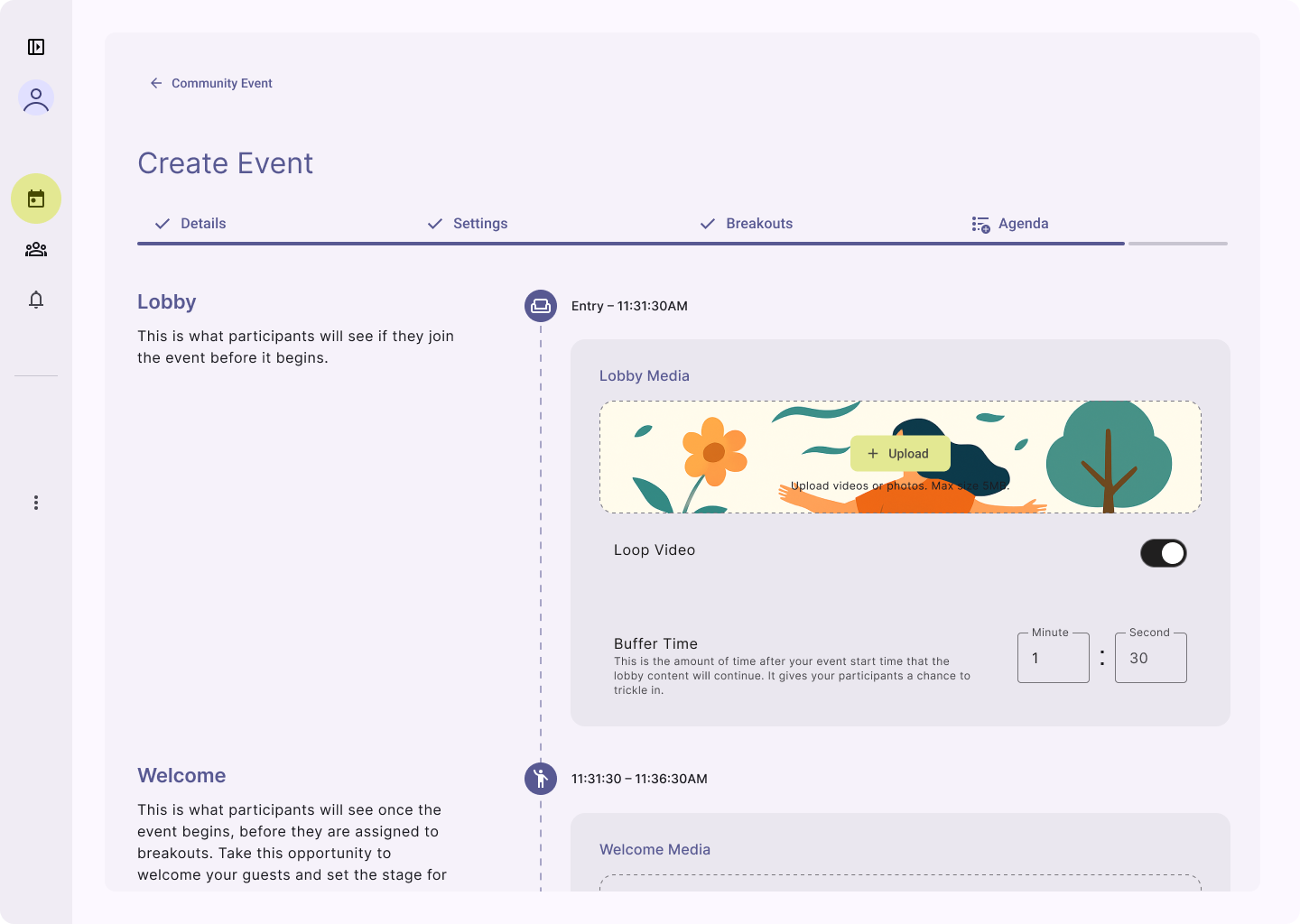
✧✧ Breaking down the complex process into four key steps, each designed to deliver distinct functionalities that are both easy to understand and highly effective.
✧✧ The Progress/Step Indicator provides clear visibility into upcoming steps, ensuring users know exactly what to expect next.
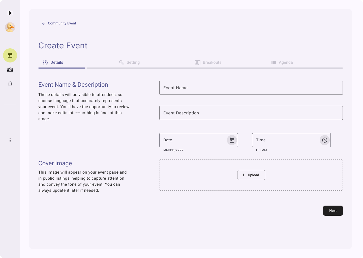
✧✧ Two-column layout - guidance on the left and action on the right - boost users’ confidence and clarify when creating
✧✧ Events are structured as a chronological flow with time to start, giving users a clear mental model for participants' experience
Other Design Input
Design-Led Product Definition
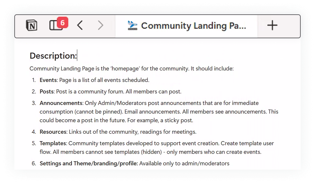
I led the early product definition process by running ideation and feedback sessions with our power users to map user flows, gather insights, and co‑create potential features. These sessions informed the PRDs I authored, which connected user behaviors, product goals, and technical feasibility into clear, actionable requirements.
By combining direct user collaboration with structured documentation, I ensured alignment across design, product, and engineering—positioning design as a strategic driver in shaping the product.
Design System Haul
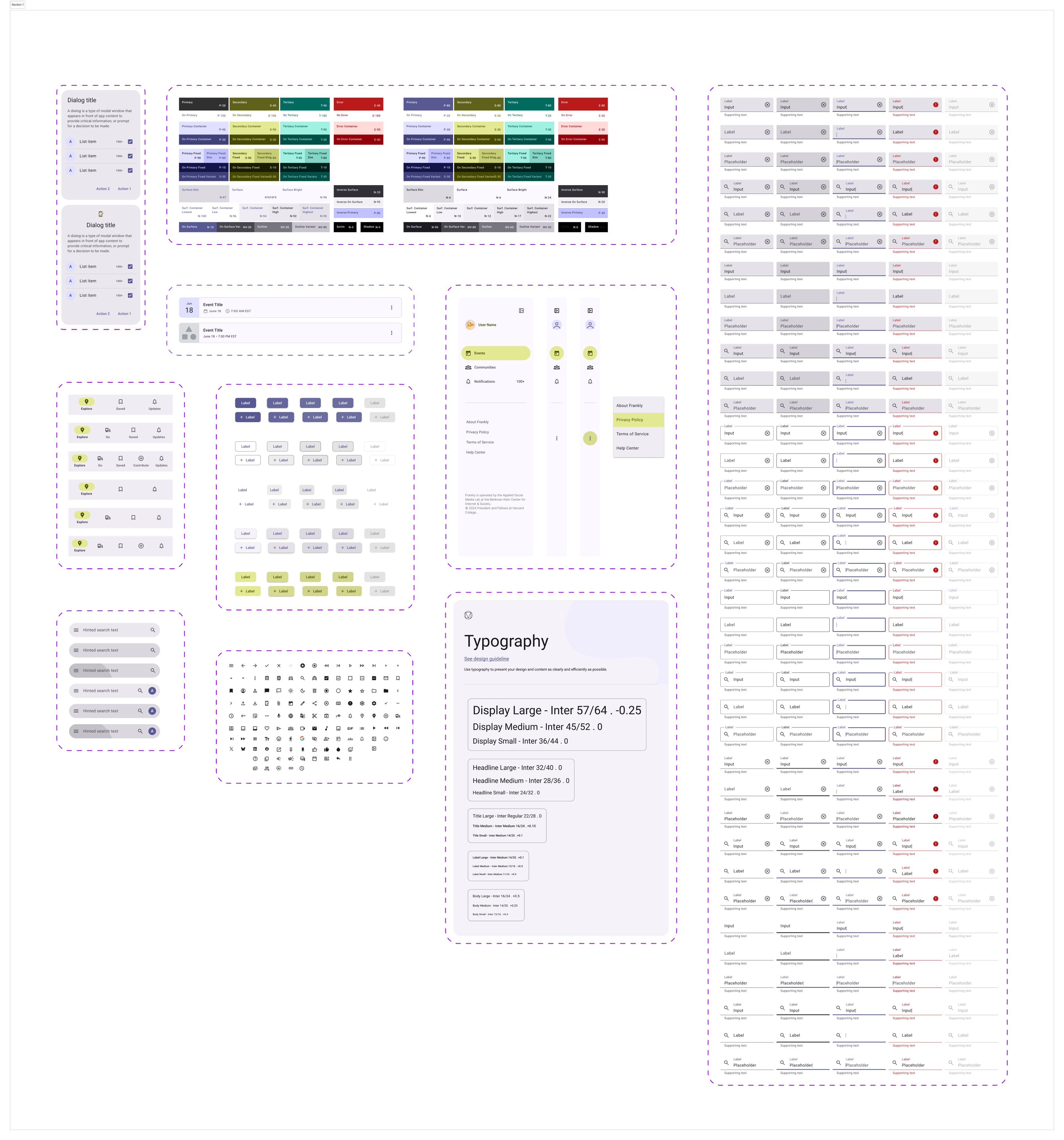
I led the creation of a scalable design system built on the Material Design 3 toolkit, transforming previous fragmented UI into a cohesive, efficient framework.
CONSISTENCY SPEEDED UP DEPLOYMENTBy consolidating 13 inconsistent button styles into just 5 standardized variants, we improved product consistency, streamlined collaboration between design and development, and significantly reduced build time.
NEUTRAL COLOR = NEUTRAL TONE
Choosing a neutral palette majorly benefits from two perspectives:
- A calm, inclusive, and neutral environment makes all topics and voices feel welcome.
- As a deliberation platform emphasizing on democracy, Frankly does not imply any political or opinion basis
- It makes the platform adaptable to the unique styles of diverse communities and allows communities to personalize their own colors in the future without clashing.
Streamlining Engineer Handoff
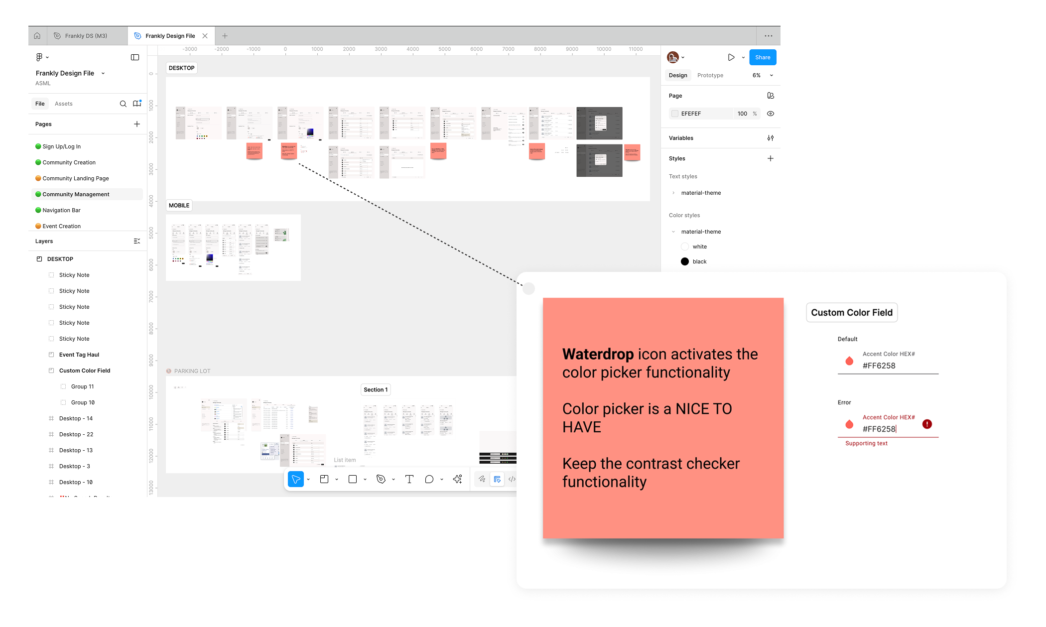
I worked closely with PMs and engineers to ensure a smooth transition from design to development. My handoff process is structured and collaborative: 1) I create annotated Figma prototypes that clearly document interaction rules and edge cases, allowing engineers to reference them anytime. 2) I also lead dedicated handoff sessions with PMs and developers to walk through user flows, explain design decisions and alternatives, and surface potential questions early. This approach keeps everyone aligned and helps maintain a smooth and efficient deployment process.
Reflection - Solo to Synchronized
I was the only full-time designer at the Applied Social Media Lab. Facing a bit tech-heavy team as the main design source was absolutely challenging in many different ways but I managed to turn them into opportunities that help the team move to the right direction:
Limited internal design resources
When I was the only designer spread across several projects, some of our team members also were bouncing between tasks and losing momentum. I proposed a weekly rotation plan so we focused on one project at a time. We rolled it out across teams, and the difference was immediate—clearer priorities, deeper design thinking, and engineers shipping faster with fewer interruptions.
Balancing iterative updates with long-term goals
Since we rolled out changes incrementally - many ideas were excellent but out of the scope for current deployment - I created living documentation to track current deployments, upcoming changes, and the bigger UX vision—ensuring design consistency while planning for future improvements
Lack of a large scale design fellows
I initiated and facilitated recurring Design Jam sessions with my PM and power users like Unify America. This helped me catch UX issues and think through an intuitive and concrete user flow before putting my pen on paper. Co-design session also helped us align on the real problems and final design decisions. It was a lightweight cadence but had heavy impact on user experience and product vision.
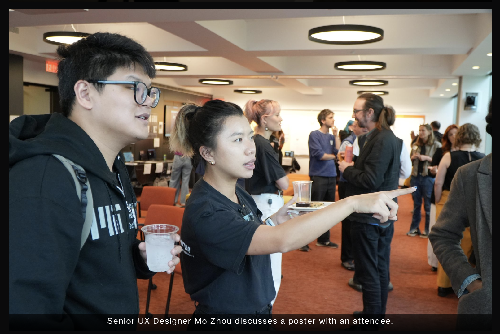
Photo source: Applied Social Media Lab website
For more detailed design process, please reach out to mozhou350@gmail.com
© 2026 Mo Zhou


Project Intro
About Frankly
Frankly is a deliberative democracy platform that transforms how communities welcome different perspectives from members and make decisions together.
With Constructive dialogue embedded in the event agenda, and smart-matching algorithm that allows event organizers to balance diversity in each breakout room, Frankly is ensuring every voice to be heard.
My Role
Senior UX Designer
design system build,
PRD writing,
Interaction,
visual design,
prototyping,
design documentation & handoff
Tools
Figma, Notion, Github
Adopted By
leading civic and dialogue organizations across the U.S. including:
- Deliberations.us
- AllSides
- Living Room Conversations
- Listen First Project
- Unify America
What makes Frankly different?
Unlike other Standard video conferencing
tools optimizing for connection efficiency,
Frankly™ is a video-based discourse platformdesigned to facilitate constructive dialogue
and collaborative decision-makingacross and within diverse groups
Offer hosted or hostless events for various meeting styles and participant preferences.
Facilitate discussions with structured agendas embedded directly within the platform.
Gather feedback and crowdsource solutions collaboratively.
Automatically create balanced breakout rooms to ensure a variety of perspectives.
Design Example
Hand-holding the event Creation Flow
THE TRIGGER
Engineering flagged a high volume of 'unfinished event drafts' cluttering the backend. Users were initiating the creation process but abandoning it halfway through.
I conducted a heuristic evaluation to understand why.
THE AUDIT
User Experience Assessment - I took screenshots of every step that users are going thru and seeing, evaluating from Visual Design, Functionality, Consistency, and Information Design perspectives.
Dead End: Zero state lacks call-to-action or onboarding guidance
Lack of System Status: Users are unsure if the event is already created/saved or being edited.
Competing iconography lacks text labels and hierarchy
THE DIAGNOSIS - THE USABILITY GAP
The interface suffered from a lack of system status visibility. Users didn't realize their drafts were auto-saving, and the absence of clear 'Next Steps' caused them to bounce out of confusion rather than intent.
THE OPPORTUNITY
How might we replace the ambiguity of the current flow with a hand-held structure, ensuring users have the clarity they need to successfully publish an event?
THE SOLUTION
✧✧ Breaking down the complex process into four key steps, each designed to deliver distinct functionalities that are both easy to understand and highly effective.
✧✧ The Progress/Step Indicator provides clear visibility into upcoming steps, ensuring users know exactly what to expect next.

✧✧ Two-column layout - guidance on the left and action on the right - boost users’ confidence and clarify when creating
✧✧ Events are structured as a chronological flow with time to start, giving users a clear mental model for participants' experience

Other Design Input
Design-Led Product Definition
I led the early product definition process by running ideation and feedback sessions with our power users to map user flows, gather insights, and co‑create potential features. These sessions informed the PRDs I authored, which connected user behaviors, product goals, and technical feasibility into clear, actionable requirements.
By combining direct user collaboration with structured documentation, I ensured alignment across design, product, and engineering—positioning design as a strategic driver in shaping the product.

Design System Haul
I led the creation of a scalable design system built on the Material Design 3 toolkit, transforming previous fragmented UI into a cohesive, efficient framework.
CONSISTENCY SPEEDED UP DEPLOYMENTBy consolidating 13 inconsistent button styles into just 5 standardized variants, we improved product consistency, streamlined collaboration between design and development, and significantly reduced build time.
NEUTRAL COLOR = NEUTRAL TONE
Choosing a neutral palette majorly benefits from two perspectives:
- A calm, inclusive, and neutral environment makes all topics and voices feel welcome.
- As a deliberation platform emphasizing on democracy, Frankly does not imply any political or opinion basis
- It makes the platform adaptable to the unique styles of diverse communities and allows communities to personalize their own colors in the future without clashing.

Streamlining Engineer Handoff
I worked closely with PMs and engineers to ensure a smooth transition from design to development. My handoff process is structured and collaborative: 1) I create annotated Figma prototypes that clearly document interaction rules and edge cases, allowing engineers to reference them anytime. 2) I also lead dedicated handoff sessions with PMs and developers to walk through user flows, explain design decisions and alternatives, and surface potential questions early. This approach keeps everyone aligned and helps maintain a smooth and efficient deployment process.

Reflection - Solo to Synchronized
I was the only full-time designer at the Applied Social Media Lab. Facing a bit tech-heavy team as the main design source was absolutely challenging in many different ways but I managed to turn them into opportunities that help the team move to the right direction:
Limited internal design resources
When I was the only designer spread across several projects, some of our team members also were bouncing between tasks and losing momentum. I proposed a weekly rotation plan so we focused on one project at a time. We rolled it out across teams, and the difference was immediate—clearer priorities, deeper design thinking, and engineers shipping faster with fewer interruptions.
Balance iteration with long-term goals
Since we rolled out changes incrementally - many ideas were excellent but out of the scope for current deployment - I created living documentation to track current deployments, upcoming changes, and the bigger UX vision—ensuring design consistency while planning for future improvements
Lack of a large scale design fellows
I initiated and facilitated recurring Design Jam sessions with my PM and power users like Unify America. This helped me catch UX issues and think through an intuitive and concrete user flow before putting my pen on paper. Co-design session also helped us align on the real problems and final design decisions. It was a lightweight cadence but had heavy impact on user experience and product vision.

Photo source: Applied Social Media Lab website
For more detailed design process, please reach out to mozhou350@gmail.com
© 2026 Mo Zhou
