
Project Intro
About Zytegyst
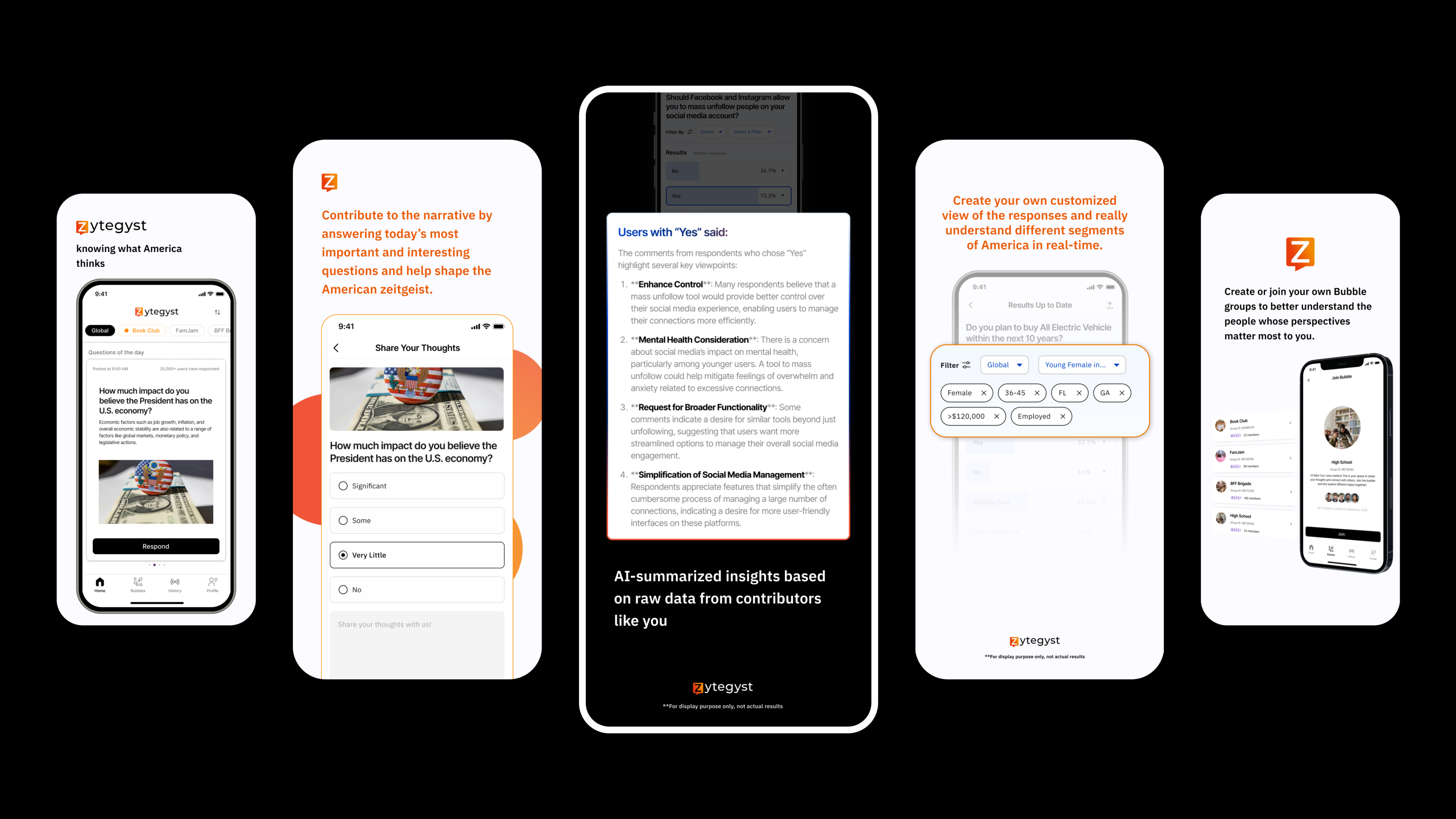
Zytegyst is an anonymous polling app where users engage with daily questions on different topics, with AI summarizing diverse perspectives along with statistic data to foster understanding and meaningful conversation.
My Role
Founding Designer
Tools
Figma, Notion
Find us live on
- Apple Store
- Google Play
Our Mission
"In today's world, hyper-polarization fueled by media, social platforms, and social pressures has deepened divisions between groups, turning us against those with differing views.Yet, in everyday life, people with opposing political beliefs work together, build friendships, and even marry. This shows that most people aren’t as divided as they seem and are willing to listen to different perspectives, especially when they know someone personally.The challenge is creating a safe, engaging space where people can listen and learn from others they don’t know, free from fear of bullying or cancel culture, leading to more meaningful, productive conversations."
HOW MIGHT WE
create a safe and engaging space for people to listen and learn from others they don’t know in real life?
Design Iteration
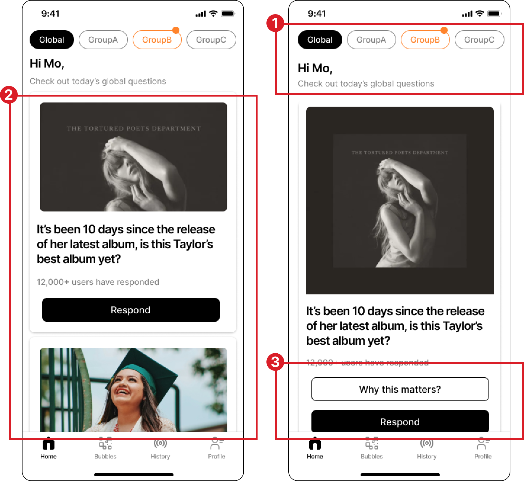
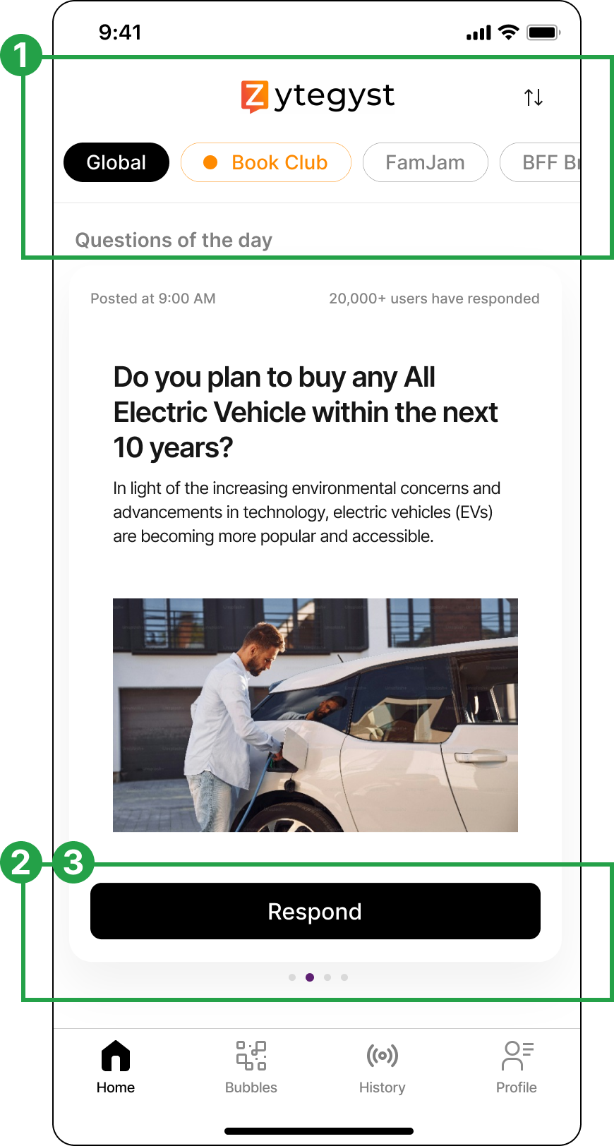
Redesign for focus - A Homepage That Boosts Clarity and User Response
BEFORE
AFTER
Key Update
Incorporated the logo to reinforce brand identity

Shifted the question card orientation from vertical (up & down) to horizontal (left & right), dedicating the entire homepage to a single question.Removed the "Why This Matters" to reduce user effort and encourage initial user engagement

Enlarged each question card, presenting users with one piece of information at a time

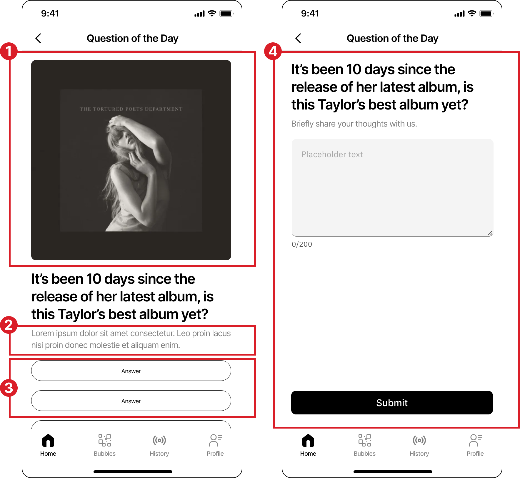
Less Taps, More Impact - Simplified Response Experience
BEFORE
AFTER
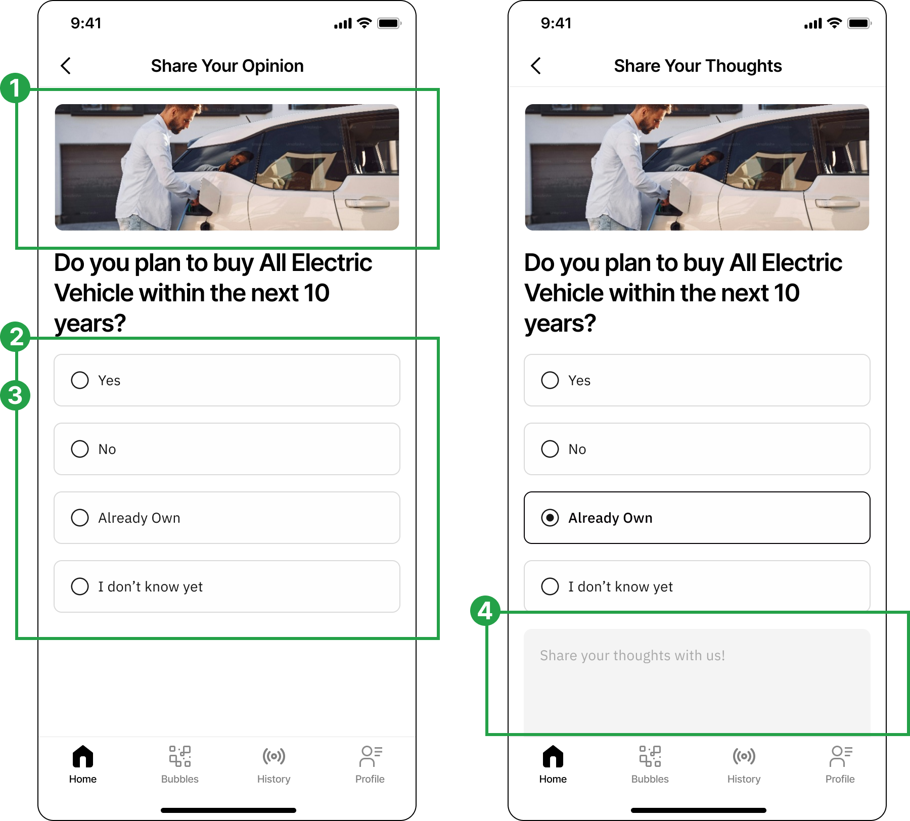
Reduced image sizes and emphasized text based on its importance in the visual hierarchy
Removed question descriptions to prioritize space for the questions and answers themselves
Converted options to radio buttons to clearly indicate a single-choice selection, as the options are mutually exclusive
”Share Thoughts” box appears after a choice is made, minimizing unnecessary page navigation and keeping users aware of their selections.

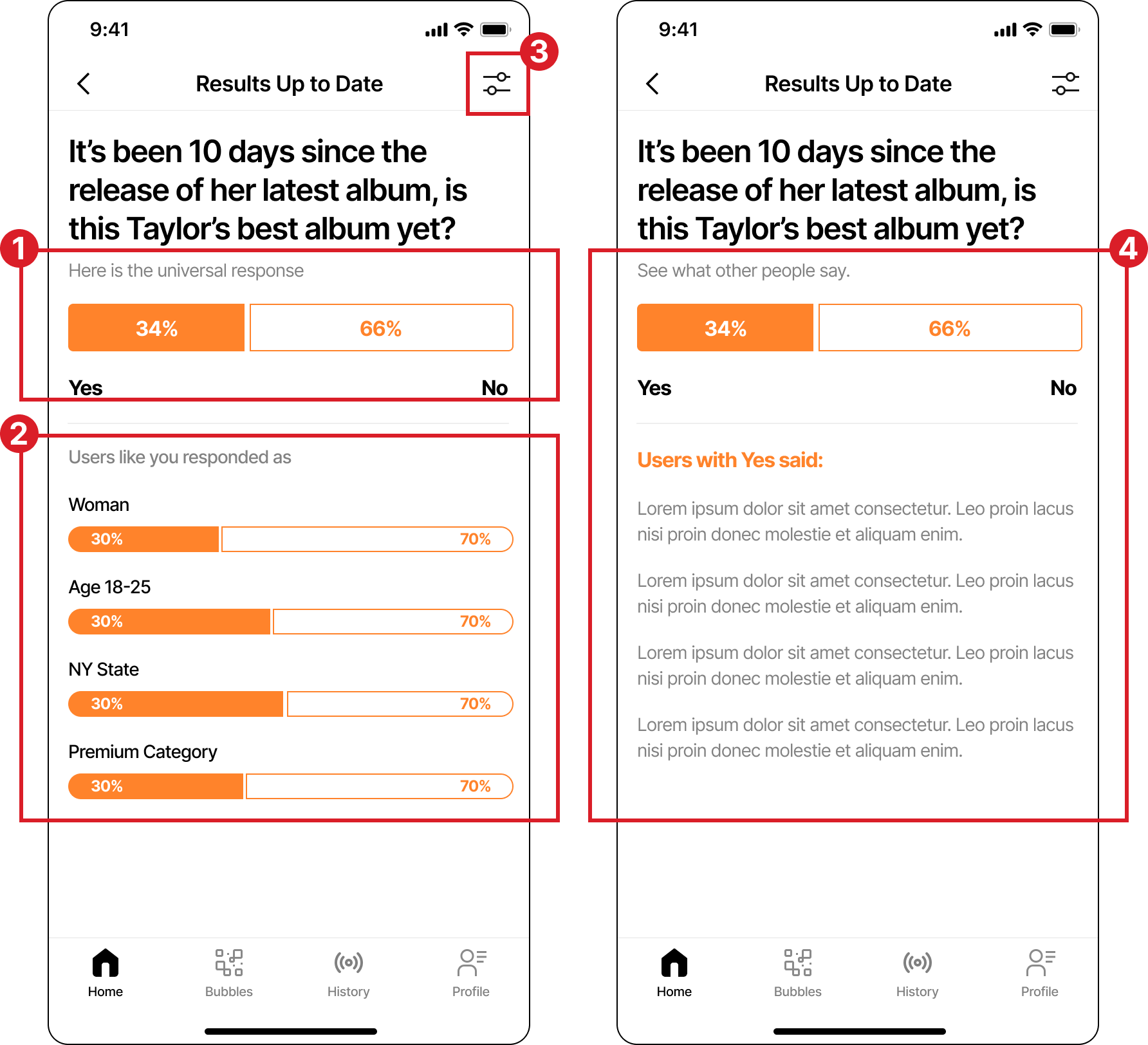
Clearer Filters, Smarter Navigation, Deeper User Insight.
BEFORE
AFTER
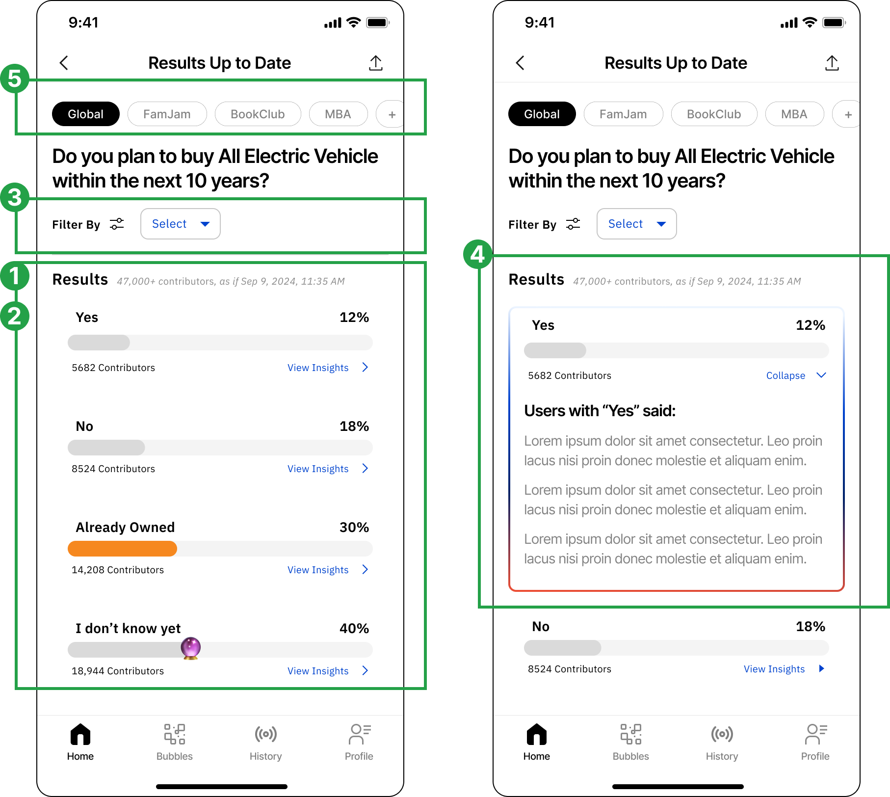
Explored diverse data display options for questions beyond simple "yes" or "no" answers
Removed the "Users Like You" section and left data open and unbiased, as our primary goal of fostering understanding among different users
Moved "Filter" to a more visible spot, encouraging users to play around with different data
Kept sentiments and data on the same page by adding "Expand" and "Collapse" options for each section, simplifying the experience and reducing the need for excessive clicking.
Introduced "Global" and "Bubble" toggles at the top, enabling users to quickly switch between demographic groups

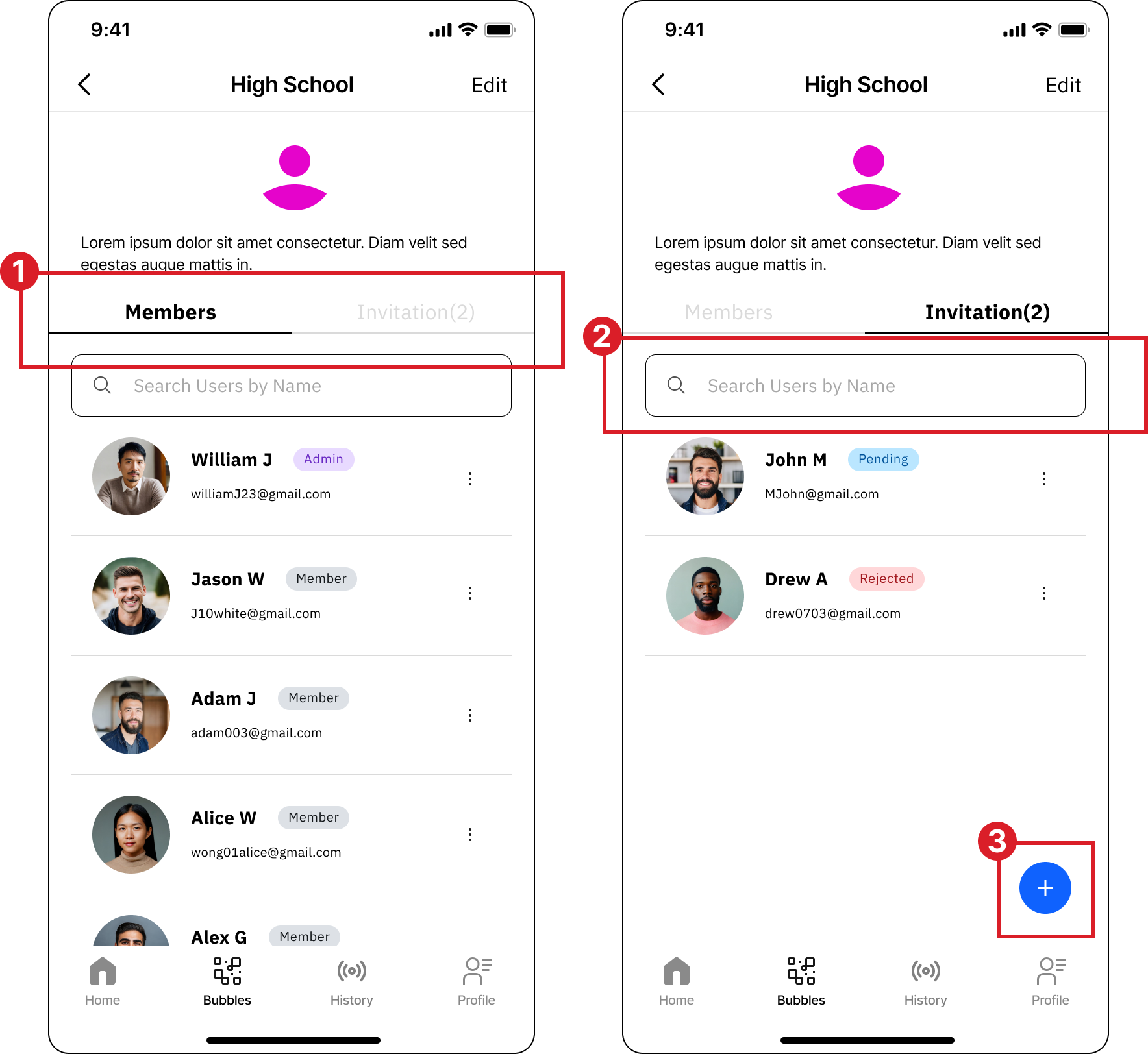
From Cluttered Lists to Clear Connections
BEFORE
AFTER
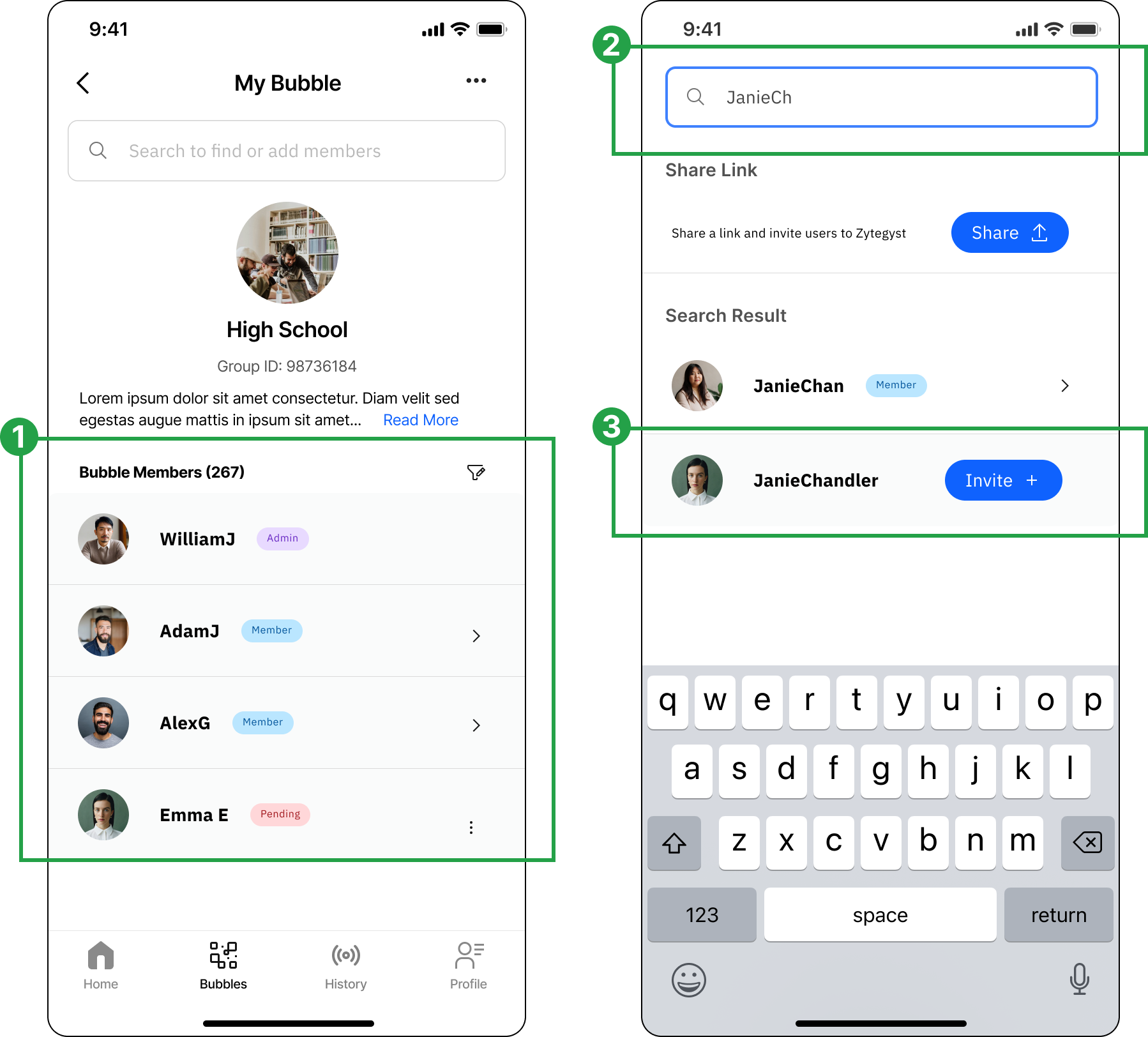
Combined "Members" and "Invitations" into a single list, distinguishing them with clear tags to maintain a clean and organized bubble page

Moved the search bar to the top, prioritizing it as a primary action for users to find specific members or add new ones
Removed the "Add" floating button and instead encouraged users to search for a target member first, then send an invite with a single click.
Reflection
This was my first experience leading the entire design process of a product from start to launch within a tight timeframe. I worked closely with the development team to ensure that each feature and user flow provided an optimal experience while aligning with our initial launch schedule.One of the highlights of this project was designing the 'Respond Question' flow, which aimed to help users capture key information and express their sentiments effortlessly. We also integrated a playful element—a game where users guess what most Americans would choose. This feature added a fun dynamic while reinforcing the product's core mission of fostering mutual understanding across the U.S.Given the time constraints, we had to deprioritize some features, such as voice input on the sentiment input page. If I had more time, implementing voice input would be my top priority, as I believe it would significantly reduce user effort and improve overall accessibili
For more detailed design process, please reach out to mozhou350@gmail.com
© 2026 Mo Zhou
Project Intro
About Zytegyst
Zytegyst is an anonymous polling app where users engage with daily questions on different topics, with AI summarizing diverse perspectives along with statistic data to foster understanding and meaningful conversation.
My Role
Founding Designer
Tools
Figma, Notion
Find us live on
- Apple Store
- Google Play
Our Mission
"In today's world, hyper-polarization fueled by media, social platforms, and social pressures has deepened divisions between groups, turning us against those with differing views.Yet, in everyday life, people with opposing political beliefs work together, build friendships, and even marry. This shows that most people aren’t as divided as they seem and are willing to listen to different perspectives, especially when they know someone personally.The challenge is creating a safe, engaging space where people can listen and learn from others they don’t know, free from fear of bullying or cancel culture, leading to more meaningful, productive conversations."
HOW MIGHT WE
create a safe and engaging space for people to listen and learn from others they don’t know in real life?
Design Iteration
Redesign for focus - A Homepage That Boosts Clarity and User Response
BEFORE
AFTER
Key Update
Incorporated the logo to reinforce brand identity
Shifted the question card orientation from vertical (up & down) to horizontal (left & right), dedicating the entire homepage to a single question.Removed the "Why This Matters" to reduce user effort and encourage initial user engagement
Enlarged each question card, presenting users with one piece of information at a time
Less Taps, More Impact - Simplified Response Experience
BEFORE
AFTER
Reduced image sizes and emphasized text based on its importance in the visual hierarchy
Removed question descriptions to prioritize space for the questions and answers themselves
Converted options to radio buttons to clearly indicate a single-choice selection, as the options are mutually exclusive
”Share Thoughts” box appears after a choice is made, minimizing unnecessary page navigation and keeping users aware of their selections.
Clearer Filters, Smarter Navigation, Deeper User Insight.
BEFORE
AFTER
Explored diverse data display options for questions beyond simple "yes" or "no" answers
Removed the "Users Like You" section and left data open and unbiased, as our primary goal of fostering understanding among different users
Moved "Filter" to a more visible spot, encouraging users to play around with different data
Kept sentiments and data on the same page by adding "Expand" and "Collapse" options for each section, simplifying the experience and reducing the need for excessive clicking.
Introduced "Global" and "Bubble" toggles at the top, enabling users to quickly switch between demographic groups
From Cluttered Lists to Clear Connections
BEFORE
AFTER
Combined "Members" and "Invitations" into a single list, distinguishing them with clear tags to maintain a clean and organized bubble page
Moved the search bar to the top, prioritizing it as a primary action for users to find specific members or add new ones
Removed the "Add" floating button and instead encouraged users to search for a target member first, then send an invite with a single click.
Reflection
This was my first experience leading the entire design process of a product from start to launch within a tight timeframe. I worked closely with the development team to ensure that each feature and user flow provided an optimal experience while aligning with our initial launch schedule.One of the highlights of this project was designing the 'Respond Question' flow, which aimed to help users capture key information and express their sentiments effortlessly. We also integrated a playful element—a game where users guess what most Americans would choose. This feature added a fun dynamic while reinforcing the product's core mission of fostering mutual understanding across the U.S.Given the time constraints, we had to deprioritize some features, such as voice input on the sentiment input page. If I had more time, implementing voice input would be my top priority, as I believe it would significantly reduce user effort and improve overall accessibili
For more detailed design process, please reach out to mozhou350@gmail.com
© 2026 Mo Zhou